Simplifying Arrival
for World of Hyatt App Users
Role
Lead Product Designer
Company
Hyatt Hotels Corporation
Timeline
2023–2024
Status
Delivered · Deprioritized by new leadership
Overview
What is this?
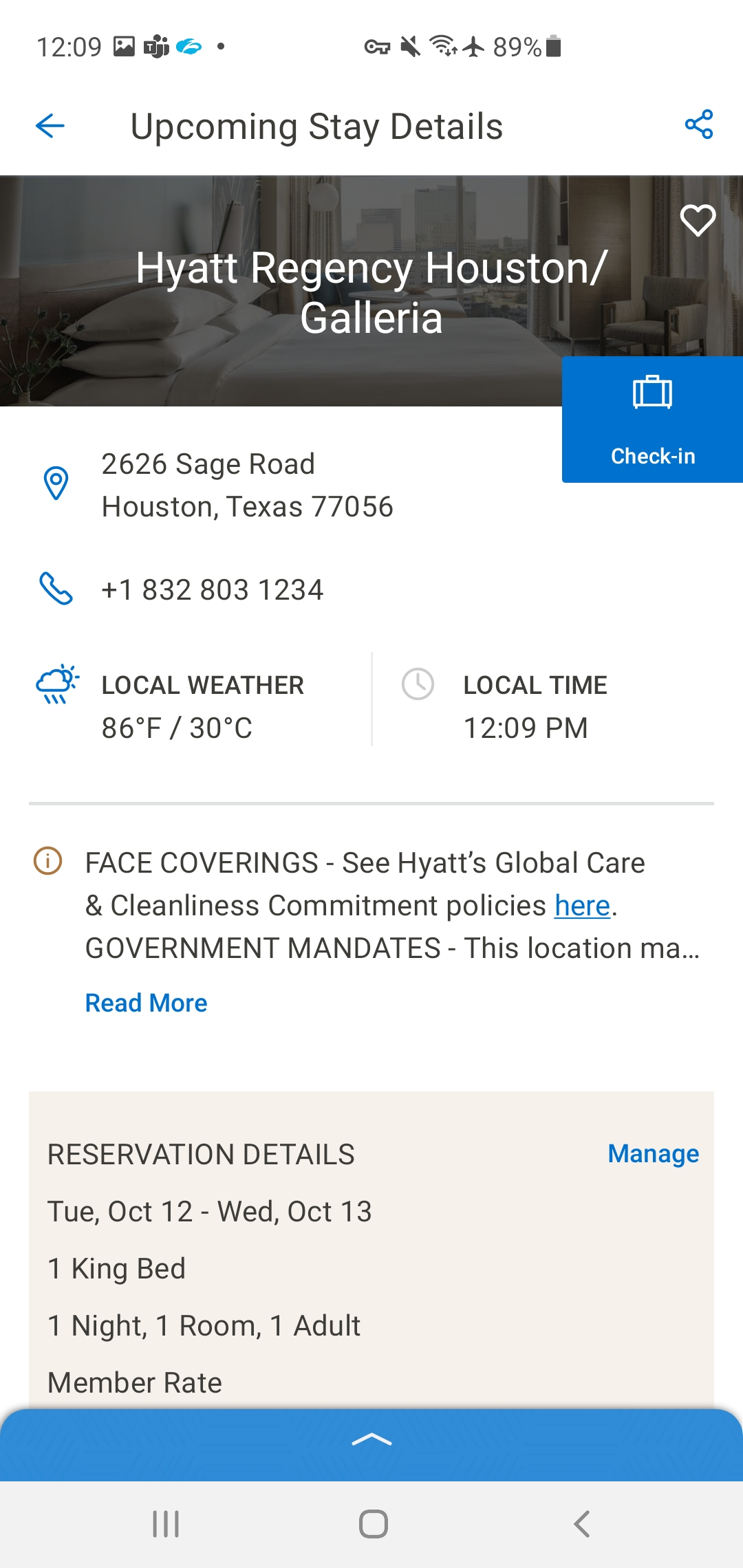
Digital Check-In is the feature in the World of Hyatt app that lets guests complete hotel check-in from their phone before they arrive. The goal was straightforward: reduce time at the front desk, give guests more control over their stay, and make the moment of arrival feel less transactional and more like the hospitality experience it's supposed to be.
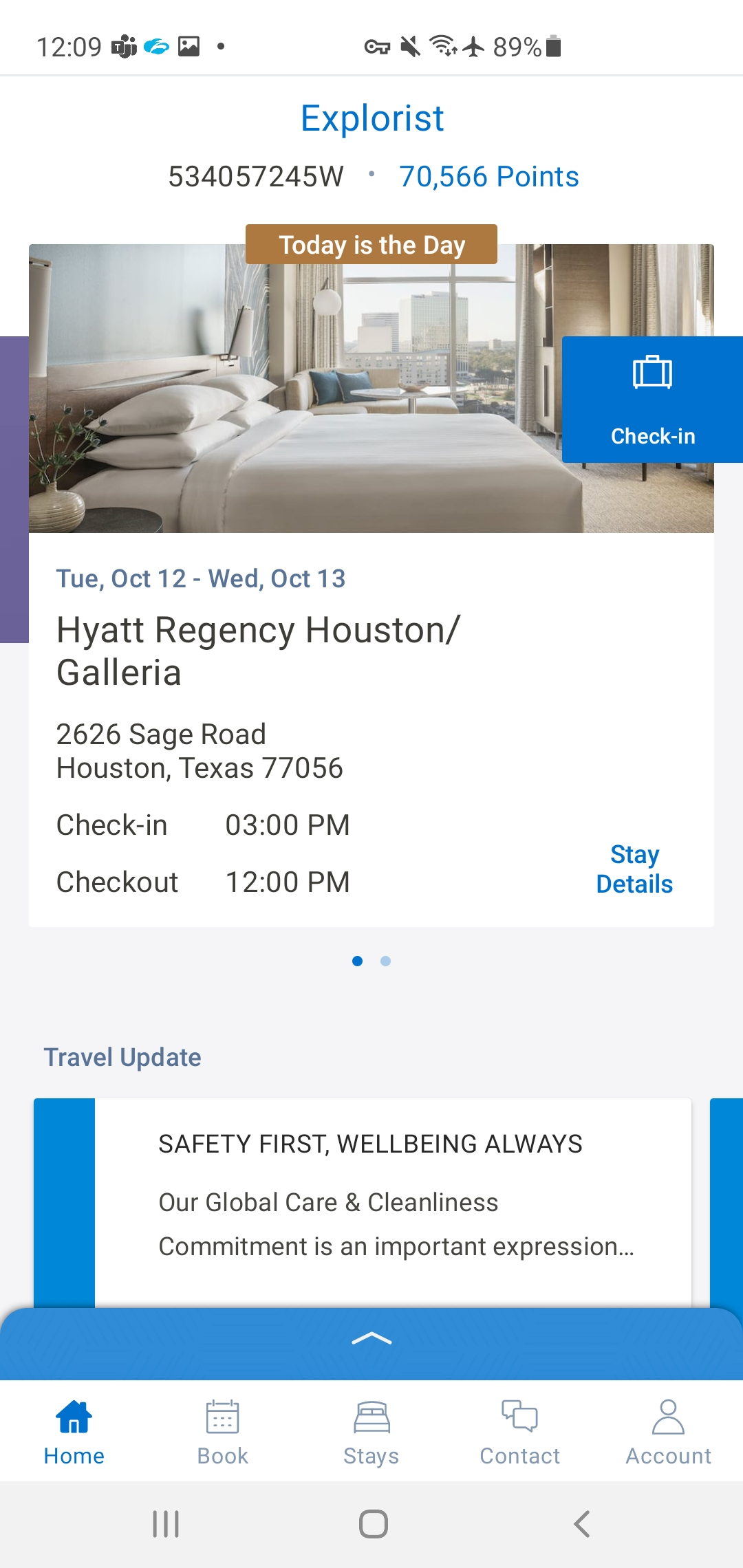
The design covers the full end-to-end flow — from the home screen stay card that surfaces the check-in prompt, through time selection, room preferences, housekeeping choices, and payment confirmation, to the final confirmation screen. Built for iOS and Android, following iOS HIG and Material Design guidelines respectively.
The problem
Check-in is harder than it looks.
A one-screen check-in would be ideal. But hotel check-in isn't a one-variable problem. Guests need to confirm or select a room. They need to make housekeeping choices. Payment may need to be verified or updated. And in hospitality, the stakes of getting any of these wrong are immediate and visible — there's a person standing at a front desk and a guest standing in a lobby.
The challenge was designing a flow that handled real complexity without feeling complex to the guest. Every screen needed to carry exactly the right information — no more, no less — and the confirmation state needed to leave guests feeling settled, not uncertain.
Design
Every screen earns its place.
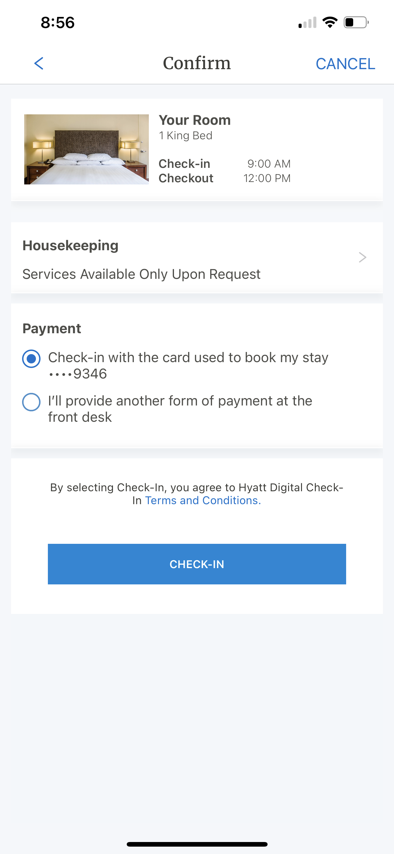
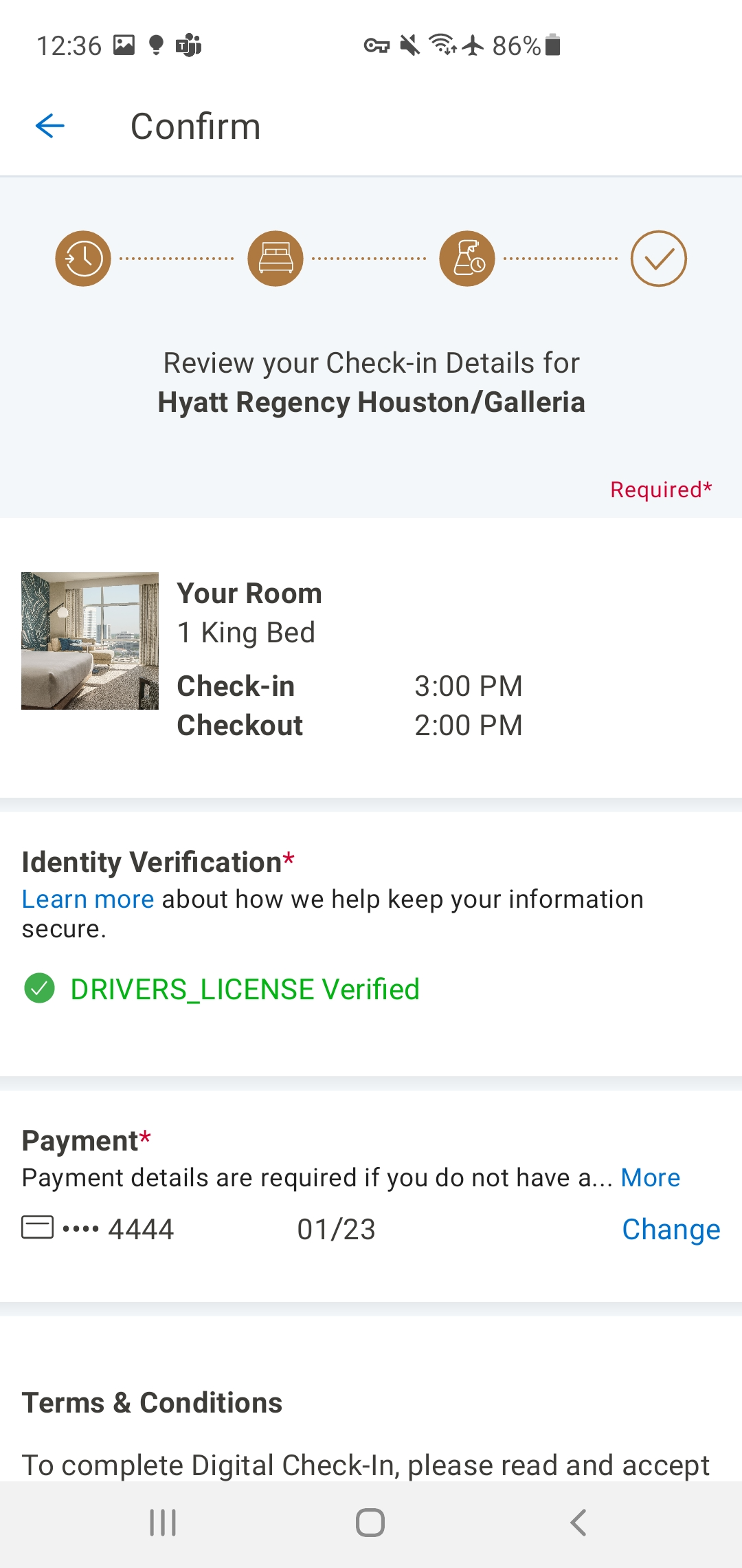
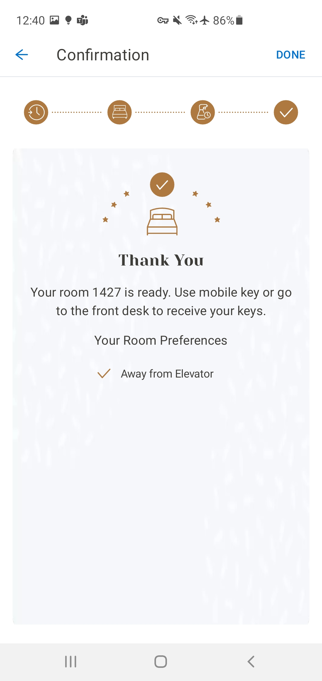
The check-in flow is five screens: home screen entry point, time selection, confirmation (room details, housekeeping, payment), success state, and post-check-in home screen. Each screen has a single job. Nothing is combined that shouldn't be, and nothing is separated that belongs together.
The confirmation screen was the hardest to get right. It needed to surface room details, housekeeping preferences, and payment information in a single view without overwhelming the guest. The solution was a scannable card-based layout with clear section labels — close enough to a receipt to feel familiar, but warm enough to feel like the beginning of a stay.
The success state ("Thank You") was designed to close the loop with confidence — clear confirmation, stay details visible, and a path back to the home screen without dead ends.
Outcome
Designed and delivered.
The check-in flow was designed and delivered — including room selection, housekeeping, payment, and confirmation. A one-screen check-in wasn't achievable given the room selection requirement, and new leadership later deprioritized the feature to maintenance mode. The design artifacts are complete and the learnings informed subsequent mobile work.
"Nelson brings a unique perspective to his work, drawing from his diverse experience in the hospitality industry to design solutions that are both innovative and user-centered. His dedication, insight, and personality will truly elevate any team he is a part of."