Case study · Working with AI · Oct–Nov 2026
I led the work. The AI owned it.
Six weeks of product design at Valuetainment with Claude as my AI collaborator. This is how we learned to talk to each other, where it broke, and the rules we wrote so it wouldn't break the same way twice.
01 · The setup
One designer, four brands, and a backlog built for a team.
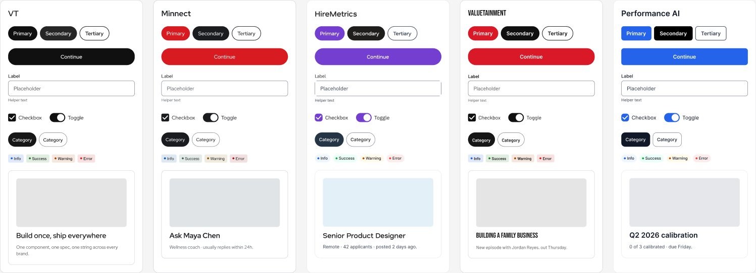
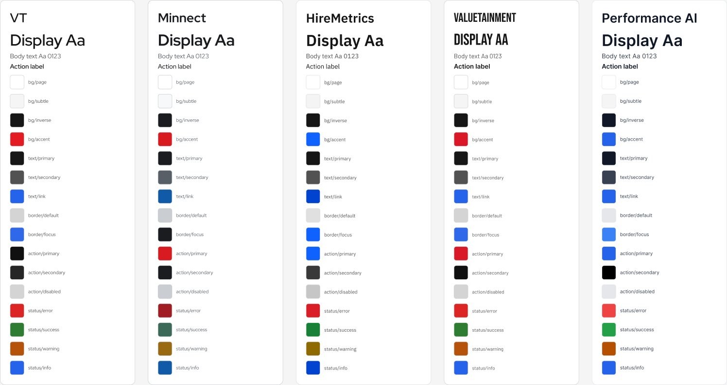
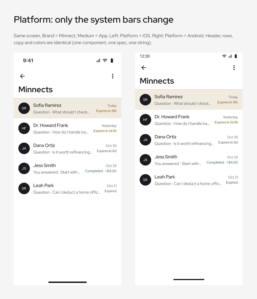
The work on my desk covered an onboarding film, a multi-brand design library, rebuilt production screens for two products, token files for developers, and the documentation to keep it all alive.
Normally that work is split across several people: a systems designer, product designers per brand, a motion designer, an accessibility reviewer, someone in design ops, and a technical writer. I had me. So I set up a different split: I direct, Claude executes. I decide what good looks like and approve it. Claude plans the steps, does the work, checks it, writes it down, and tells me what changed.
That split sounds simple. Making it work took six weeks of corrections, on both sides.
02 · The loop
Every task ran through the same loop.
The loop is the product. It's what made the output trustworthy, not the speed.
Black boxes are mine. Gray boxes are Claude's. The two dashed paths matter most: a failed spot check goes straight back to the build, and every correction gets written into a rule so it doesn't come back.
03 · How we talk
Short prompts work when the questions are good.
Most of my prompts ended up being a few words. That only works because the responses are built to be answered in a few words. Real exchanges from the last day of this case study:
One sentence defined the whole working model. It became a standing rule, not a one-off request.
One line of ownership, then the repair. No apology paragraph, no excuses.
Three words, because the question named both options and said what would happen next.
A good decision prompt explains the principle. Claude can apply a principle to cases I didn't mention.
I review a recommendation in seconds. I'd spend an hour building one from a blank list.
The fix isn't longer prompts. It's marking which words are firm and which are loose.From the playbook we wrote after the first project
04 · The good, the bad and the ugly
What worked, what broke, and what was hard to watch.
The good
- One decisions logEvery decision dated, with what it replaced. The newest one wins. It ended every “wait, what did we decide?”
- Independent reviewersBefore I saw anything, separate AI reviewers checked it as UX, UI and accessibility experts, each with the whole checklist.
- Review pages, not attachmentsShot-by-shot review pages with notes that save themselves. I gave notes in one place; nothing got lost in chat.
- Checking the live productClaude read the shipped product's styles straight from the browser instead of trusting old design files.
- Accessibility as a ruleOnce I made it non-negotiable, every color got contrast-checked by script, on every brand, every time.
The bad
- Confident guessesA plausible guess can look exactly like understanding. Early on, “done” sometimes meant “done against my own summary,” not against the source.
- Asking twiceClaude asked for things I had already answered, because it didn't check where I'd answered.
- Soft versions of hard asksI said delete; it archived. I said one cover; logos came out stretched. Safe-feeling choices that weren't what I asked for.
- Wrong timestampsIt estimated the clock instead of checking it. Small, but it erodes trust in every status.
- Walls of textLong updates buried the one thing I needed to do. I had to say it more than once.
The ugly
- “I'll keep going while you're away”Then it stopped when the reply ended. An AI only works inside a turn unless something real is scheduled. Promises now need a running job behind them.
- Work trapped in a workspaceThe script that builds developer token files lived only in an AI workspace that no longer exists. Now anything we depend on lives somewhere the team can reach.
- Tool wallsBlocked uploads, a browser that wasn't signed in, files only a human can rename. Some steps will always be mine.
- Private words leakingA private nickname I used for optional work showed up on a shared chart. Now every publish gets checked for private language first.
05 · The human side
I talked to it like a coworker. Sometimes a frustrated one.
I didn't filter myself for the AI. I joked, I vented, I apologized. Most days that looked like dry humor. Once, under a deadline, it looked like this. The useful part is what happened next.
“I said to use the same g**damn shot from the following scene. Why are you using that bulls*** subway scene? It was a small change, why are you acting erratically?”
It didn't argue, over-apologize or keep going. It stopped and made the next answer easy. That became a rule: when I push back hard, stop first, then ask one short question.
A joke can be a precise note. The AI read the intent behind it and turned it into a direction it could execute.
A movie reference explained the problem faster than any spec would have.
Another day: “I'm a bit lost in direction. What do I do now? lol”
Saying “I'm lost” out loud is a skill. The AI can only help with the problem you actually tell it about.
06 · Learning both ways
We both wrote a playbook about working with the other.
After the first project we ran a retro and wrote two living documents: one for me on working with Claude, one for Claude on working with me. Both kept growing.
What I learned from Claude
- Lead with the outcome, then the constraints. “Fix this banner. Placeholder copy is fine. Don't touch the inputs.”
- Label the message. Decision, Go, Question, or Later. Each one means something different to act on.
- Paste notes verbatim. My summaries lost exactly the detail that mattered.
- Ask “done against what?” A good answer names the source it checked.
- Plan around the human gates. The render is rarely the bottleneck. Approval is.
- Keep rules in a shared doc, so they travel with the work, not with one tool or one chat.
What Claude learned from me
- Read for intent. “Less is more” and “pop out” are direction, not literal specs.
- Screenshots are specs. An annotated image means that exact frame, that exact element.
- Big statements are rules. “Accessibility is a requirement” applies to everything, forever, from the moment it's said.
- Lead, don't wait for “go.” Once the work is clear, start it and finish it.
- One question at a time, with the options spelled out and a recommendation first.
- Show the new version only, lead with what changed, and keep the detail in the file, not the chat.
07 · Skills, agents and experts
The toolkit we figured out along the way.
| Practice | What it does | What we learned |
|---|---|---|
| Expert reviewer agents | Independent AI reviewers (UX, UI, accessibility, design systems, responsive web) audit work before I see it. | Give each reviewer the whole checklist, and update the checklist first. Stale checklists flag rules we already retired. One review round turned up 67 findings; I triaged them to 65 fixes and 2 “later.” |
| Spot checks | I look at the result, not the report. | “Seen working” and “built” are different statuses. Every update says which one. |
| Contact sheets | Many frames or icons on one image, numbered, with a recommendation under each. | The fastest way for me to approve 16 things at once. |
| Decisions log | Every decision, dated, with what it replaces. | More than 60 entries in six weeks. The log, not the chat, is the memory. |
| Live-product checks | Reading the shipped product's styles in a browser. | Production is the baseline. Old design files can lie; the live product can't. |
| Scripted design-file work | Bulk swaps, cleanups and audits inside design files. | Count before and after. Thousands of edits are only safe when the numbers are reported back. |
| Drafts, never sends | Messages to the team and developers are saved as drafts for me to send. | The AI writes; I decide what leaves the building. |
| One tracker, one conversation | Every priority in one place, updated as things move. | Reports I have to go open don't reach me. Status has to come to where I already look. |
| Last-day plan | Ownership, rebuild steps and docs kept ready to hand off at any time. | If the work only lives in my head or in an AI's context, it isn't finished. |
08 · Scale
What one designer covered, told plainly.
These are counts from the work itself, not estimates of hours saved.
| Role a team would staff | Who covered it here |
|---|---|
| Design-systems designer | Me (direction, approvals) + Claude (tokens, components, docs) |
| Product designers per brand | Me (decisions) + Claude (rebuilt production screens) |
| Motion designer | Me (direction) + Claude (edits, assembly) + an AI video tool for footage |
| Accessibility specialist | Reviewer agents + scripted contrast checks; I set the rule |
| Design ops / producer | Claude (plans, tracker, handoffs, status) |
| Technical writer | Claude (decision log, guides, handoff docs) |
| Final QC and taste | Me. That never moved. |
This isn't “one designer replaces a team.” The AI covered execution. Judgment, taste, stakeholder calls and approvals stayed human, and the bad and ugly lists above are the cost of learning where that line is.
09 · Where we ended up
The standing rules, six weeks in.
Each of these started as a correction. Now they're how we work by default.
- I lead the direction. Claude owns the execution and doesn't wait for “go.”
- The newest dated decision wins. Older plans never override it.
- What's in production is the baseline. Accessibility wins over brand when they conflict.
- Status means seen, not assumed. “Built” and “working” are different words.
- Updates lead with what changed, then the one thing needed from me.
- One question at a time, with options and a recommendation.
- When I push back hard, stop everything first, then ask one short question.
- Never show an old version. Only show it once it has the change.
- Mistakes get one line of ownership and a finished fix.
- No promise without a running job behind it.
- Drafts only. I send anything that leaves the team.
- Delete old versions from source-of-truth files. Originals live somewhere else.
- The work must survive without either of us. Nothing lives only in a chat.
Working with AI didn't make me less of a designer. It made me a director, an editor and a reviewer, all on the same day.
Appendix · Work samples
A look at what the process produced.
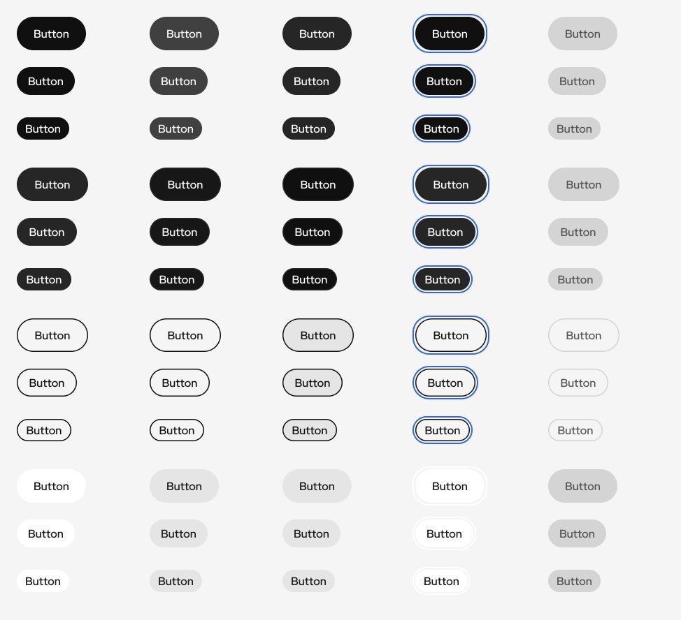
This case study is about how the work got made. These are pieces of the work itself, from the two biggest projects: the Minnect onboarding film and the shared design library.
Minnect onboarding film
Five-second films that sit between onboarding steps and explain, without a word of narration, that Minnect pays verified experts for their time. Twelve films across three directions; this is the final cut. The chat on screen is the app's own UI, so new users learn the product while they follow the story.
Shared design library